Showing posts with label Foundation Diploma. Show all posts

Sunday, 13 January 2013

The Technical Stuff


For this, my final, blog, I will be discussing materials I would use to make the sculpture I showed you in my last blog should I construct it, as well as how the entire mechanism of the sculpture will work for the spiral to turn and the shell to open and close on its own simultaneously.
The mechanism will be housed in the base of the sculpture which will be constructed out of wood. It will mainly be a plain wooden box, except for a 20cm diameter turntable in the centre. The turntable will have three small wheels attached to the bottom to help it turn. Attached to the underside of the turntable will be a simple model train set’s motor. This motor will turn the overhead turntable slowly as well as the coil on top of that.
The coil will be made out of copper as it is an easily pliable material and is still very sturdy, even after being bent in such a way. The plates at the top and bottom will also be made out of copper and they will be soldered onto the coil.


The seashell will be made out of clay and the top and bottom will be held together by a using a small hinge. To have the mermaid bend and fit inside the shell when it’s closed, I will draw it on paper in two pieces. The tail and the body will be drawn onto two separate pieces of paper and then attached onto two small pieces of plywood cut out in the same shape as the mermaid. They will be held together again using a small hinge and will be placed at an angle so that both the top and bottom can be seen. At the back of the vertical piece of wood will be another piece of wood attached to it which will hold it to the inside of the shell, this will help to push the mermaid down as the shell closes and pull it as the shell opens.


Now on to, perhaps, the most important part of the sculpture and the main part of the mechanism. How the shell will open and close. The rod will be glued to the inside of the shell and go through the bottom of the shell, the top plate, the bottom plate and the turntable through a small drilled hole in each of them. Inside the base the rod will go down straight to the bottom, where a wheel will be attached to help the rod move smoothly in a circle inside the base. Along the moving perimeter of the rod will be a small slope made out of wood. The rod will move along the bottom climbing up the slope and pushing the shell upwards as it moves.

So that is my final concept and how it works, I hope you like it. J

My Final Concept


So, FINALLY, this is my final concept:


This is my concept idea for a sculpture. I got the idea for the spiral shape from the basic shape of ‘The Monument to the Third International.’  The idea for the wave came from the Japanese wood-block printing of ‘The Great Wave of Kanagawa’ which admittedly reminded me of a sideways coil, so rather than transforming it into just a coil I turned it vertical to make the ‘storm’ depicted in the print much more menacing.

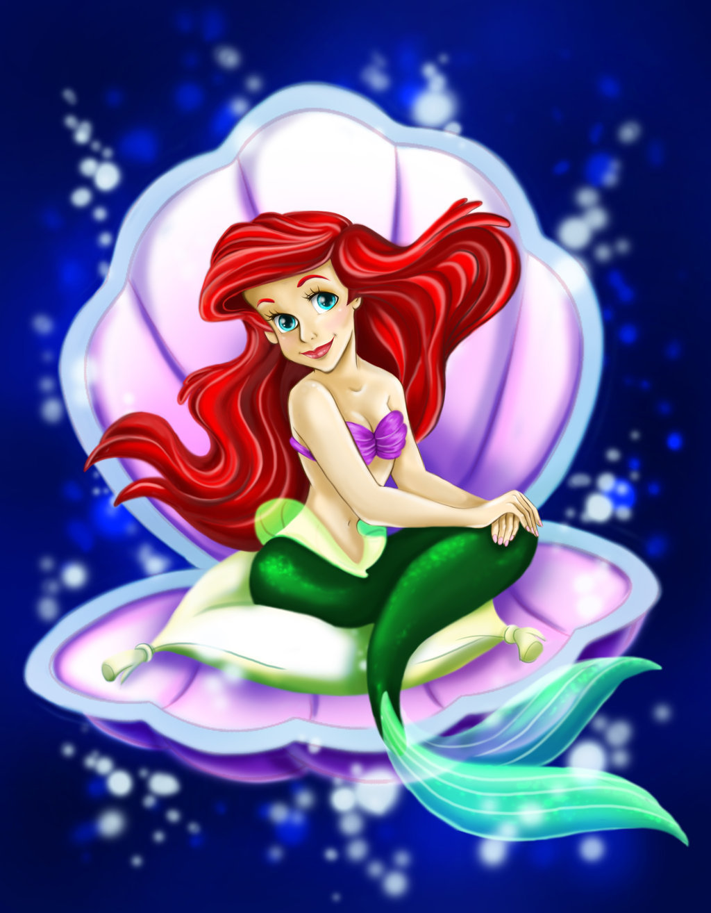
On the top plate I put a seashell which will open up (due to a mechanism very similar to a cam) to reveal Ariel, the mermaid (the main character in the movie I chose), sitting down in the seashell. Rather than menacing this detail makes it more whimsical. 

So, that’s my final concept. In my next (and final) blog I will be discussing, in detail, how the mechanism will work and what materials I would be using for the sculpture.


Friday, 11 January 2013

The Little Mermaid

 A few weeks ago I was carrying out some research on different decades in film and I came across something called the Disney Renaissance - since I had never heard about it before, I decided to look it up.

The Disney renaissance was a period between the 1980s and 2000 when Walt Disney Studios went back to producing animated movie musicals which remains, to this day, the type of movie that the studio is most known for.  During this period Disney produced works such as Mulan, Hercules and The Little Mermaid.

As I was reading this, a million ideas started going through my head for my final concept. Since it was my favourite Disney movie when I was younger, I looked into how I could use the Little Mermaid for my final concept.

This is perhaps the most iconic picture of Ariel:


and this is my most favourite scene in the whole movie:

Part of Your World


Another reason why I decided to use the Little Mermaid is my chosen theme. I chose transformation and the Little Mermaid is a story about how a mermaid is transformed into a human girl to go on shore and find the prince she loves (the usual Disney recycled plot). The evil witch, also half octopus, transforms herself into a human to stop Ariel from meeting the prince.

I have now changed my idea for my final concept completely but I feel more confident in the idea I have now. In my next blog I will be showing you my final sketch.

Wikipedia, the free encyclopedia. 2013. Disney Renaissance. [ONLINE] Available at: http://en.wikipedia.org/wiki/Disney_Renaissance. [Accessed 11 January 2013].

 Disney, W. (1989) Ariel in a seashell. [image online] Available at: http://images5.fanpop.com/image/photos/30300000/ariel-little-mermaid-msyugioh123-30356694-1024-1314.jpg  [Accessed: 11th January 2013].
RainybopStarWars, 2007. Part of Your World (English). [video online] Available at: http://www.youtube.com/watch?v=cS8C92Yi7Zo [Accessed: 11th January 2013]

The Monument to the Third International

Last week I was going through my design notes to see if I had written down anything on De Stijl and I came across a note for 'The Monument to the Third International' and since I had no picture of it in my notes I went and looked it up.

The Monument to the Third International
Also called Tatlin's Tower (after Vladimir Tatlin who designed it), it was designed as a monumental building, planned to be buil in St.Petersburg as the headquarters and monument of the Comintern which is also known as the Third International. It was designed in 1919 after the Bolshevik Revolution in 1917 and it was to stand higher than the Eiffel Tower, however it was never built and the only memory of it is a model.

Personally it reminds me  a bit of a pen coil, and it has also given me a new idea for my final concept.

References:

Tatlin, V. (1919) The Monument to the Third International. [image online] Available at: http://files.archinect.com/uploads/ai/aiu_ground_up_from_ground_zero_01x.jpg [Accessed: 11th January 2013].
Wikipedia, the free encyclopedia. 2013. Tatlin's Tower. [ONLINE] Available at: http://en.wikipedia.org/wiki/Tatlin%27s_Tower. [Accessed 11 January 2013].

Concept Idea No. 2

After some time thinking about my final concept piece, I went back to my last development and changed it a bit. This is how it looks now.


It's A Strange World.
 I prefer it to the first one seeing as the De Stijl 'window' didn't turn out as I had originally intended. In the original movie screenshot the moon and Jack Skellington were the focus of the picture. After my initial changes it was the wave that pulled the most focus. After the new changes, it is once again the moon and skeleton that pull focus.

Also the colourful moon make the view seem stranger and creepier than it really is. I'm still not convinced that this will be my final concept however I think I have finally settled on one combination of art, design and film.


References:
Since the above artwork is a change of an already original idea I had, i did not feel the need to add any references in this blog. 

Concept Idea No. 1

Looking Through the Window (Climbing The Waves)
This is a personal response to the three aspects which I chose. I took a scene from the movie where Jack Skellington (the protagonist of the movie) is climbing the movie’s iconic swirly hill (seen in y last blog) and set that picture as the background of my development.  Next I took ‘The Great Wave’ and inverted it horizontally to get roughly the same shape of the hill in the movie. I digitally copied the inverted wave 5 times to completely cover the foreground of the hill and the cemetery on the movie still. I then placed these five copies as best I could to cover the foreground and still let it look natural.
I blended the ends of each layer together to make it look more whole rather than placed and pieced together. I would have liked to cut out the boats on the wave however when I tried that the wave didn’t look as natural and menacing as it had before. I was very pleased with the final result of this step and would have liked for it to be the very end result, however seeing as I still needed to incorporate design into the piece I took one final step. I took a copy of Piet Mondrian’s ‘Composition II in Red, Blue and Yellow’ and placed it foremost on the picture so that it completely covered the picture of the man climbing the waves. I turned on the Overlay option for this layer and played with the opacity until I was happy with the final look. I did this to make it look like a Chinese screen window with a light in front of it therefore making it more see-through than a screen would usually be. (This aspect was inspired from a scene from the movie Mulan after having watched it last week).
I could have decided to say it was stained glass however I decided to keep the aspect of oriental culture (woodblock printing as very popular in Japan and the great wave is made using this technique) and say that it was a Chinese coloured screen window instead. Even though it wasn’t my first choice for the finished piece I am quite pleased with the end result – had I not needed to incorporate all three areas I would have left out the De Stijl composition and let it be just a man walking on a monstrous wave rather than the same thing being seen through a window.
Although I know this will definitely not be my final concept – I feel that I’m on the right track when it comes to combining the three elements.

References:
These are the pictures I used to create my final piece:

Mondrian, P. (1930) Composition II in Red, Blue and Yellow. [image online] Available at: http://www.pasunautre.com/2010/12/22/de-stijl-here-neoplasticism-and-the-20th-century/  [Accessed: 15th December 2012].

The Nightmare Before Christmas

Since our final piece has to incorporate art, design and film all together, and I already had design and art down I was looking for a film to inspire me to actually do something based on one of the characters etc. I was stuck until my sister came into the room and started singing (ironically) ‘This is Halloween’ from The Nightmare Before Christmas.  I had finally found my movie and then I started looking up images from the movie (Thanks to my good friend, Google). Obviously the first image to come up was this:


And immediately I thought of ‘The Great Wave’ which is what made me think – this little fact might just make my merging the three together slightly more simple (I still have no idea what I’m gonna do but, this should only help me more). I might just have another Eureka moment at 4 a.m. – hopefully not but the greatest ideas do start off at the worst times.

References:

Burton, T. (1993) The Nightmare Before Christmas. [image online] Available at: http://www.wallchan.com/images/thumbs/6988.jpg [Accessed 10th December 2012]

De Stijl

Composition I in Red, Blue and Yellow

De stijl has to be one of my most favorite movements in design. I particularly like it because of the geometry and the colours which is strange because I don’t usually like the colours red and yellow – but this is one of my most favorite compositions because it has no subject, and makes the viewer use their imagination. It can evoke many different emotions and memories. I will definitely be using this as the design part for my final concept.

References:

Mondrian, P. (1930) Composition II in Red, Blue and Yellow. [image online] Available at: http://www.pasunautre.com/2010/12/22/de-stijl-here-neoplasticism-and-the-20th-century/  [Accessed: 10th December 2012].

Guinness Surfer Ad


I found this video on Youtube as I was searching for wave scenes to tie in with the two artworks in my last two blogs and I found this one – I feel it incorporates them both very well – especially the second one.

Guinness Surfer Ad.
 

Guinness has always been known for its iconic advertisements – and this was an award winning one back in 1998. It was part of the “Good things come to those who wait” campaign during that year. It shows that a surfer waiting for the perfect wave and a person waiting for the perfect pint of Guinness are the same. The anticipation and feeling of reward are the same. One could argue that they are depicting the perfect pint of Guinness as a natural occurrence like a wave and just as frothy. I don’t know how this could be helpful in my design for my final concept but I just thought it was a really good adaptation of ‘The Great Wave off Kanagawa’ and ‘The Horses of Neptune’ from two static images to two moving ones.

References:

Alltmor, 2008. Guinness Surfer Ad (with Horses) 1998. [Video online] Available at: http://www.youtube.com/watch?v=Y9znA_dwjHw [Accessed 8th December 2012]


The Horses of Neptune

The Horses of Neptune

I found this painting which reminded me of the one I wrote about in my last blog. However in this painting the froth of the sea has been transformed into horses – The Horses of Neptune actually. I guess you could call this an adaptation of ‘The Great Wave’ except that the colour scheme is based more on neutral tones such as yellows and browns rather than shades of blue. I think the most appealing aspect of this painting is the horses. I do love a good painting of a horse – perhaps because they’re such beautiful creatures, even when they are stationary. Maybe I’ll replace the first painting with this one and use this in my concept rather than the first because I feel it has been used too much before.


References:

Crane, W. (1892) The Horses of Neptune. [image online] Available at: http://www.artmagick.com/pictures/picture.aspx?id=5986&name=the-horses-of-neptune  [Accessed: 6th December 2012].

The Great Wave off Kanagawa

The Great Wave off Kanagawa
  
The teacher showed us this artwork last week and the moment I saw it I immediately knew I wanted to do something with it. I mostly like it because whereas usually for stormy seascapes artists use darker and grayed out blues, Hokusai used clear blues and white. I have also always been a fan of oriental cultures and wood block prints but I’ve never seen this one until recently. It reminds me of Hawaii, it looks more like one of those waves people surf on rather than a wave in a storm. This is something I will definitely be incorporating in some way or another in my final concept, I’m still not 100% sure how as I have many ideas how this can be adapted, but I will definitely be using this.

References:

Monday, 19 November 2012

Fashion in the 1940s, 50s and 60s


The other day I was looking at some dresses to inspire me in something and I noticed one article that said that the 50s style was coming back, so I decided to do a little research on my own. As I was looking at a various array of dresses from the 1950s, I couldn’t help but wonder what a radical change World War II bought in fashion (along with other various elements) and how it might’ve changed in the course of only 5 years after the war, so today I will be looking at transformation in fashion design between the 1940s, 1950s and 1960s.

The 1940s

Being that people’s minds were focused on more important things during the war, you would have expected fashion to take a huge downturn, but for women’s fashion (especially in America) this wasn’t the case. Granted, not as much money was being spent as before, but considering that the war could have completely destroyed the fashion industry, it was still going pretty strong. Let’s take a look at some of the predominant design features during this decade.


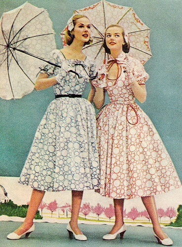
As one can easily see from the picture above, colours were much scarcer during the war – this was because most of the designs were inspired by the soldiers’ uniforms which all came in various shades of grays, greens and browns to help blend into the background. This was mostly due to the fact that women were not allowed to be soldiers, and so designers gave the women a little of what they wanted. Whereas the predominant designs in the previous decade all featured straight shapeless silhouettes, designers were now looking at clinched waists and straight pleated skirts to create a simple hour-glass silhouette. Again, looking at the soldiers’ uniforms, designers started introducing belts or buckle embellishments at the waist. Skirts became shorter, and it became a common thing to see a skirt hemmed just under the knee. Since more and more women were going out to work, dresses needed to be more functional rather than fashionable (as always designers strived to achieve both). Since everything was being rationed, there was less fabric to go around and so women needed to be able to make more from less which


led to plainer, simpler dresses, in other words: They were making the dresses just to have something different to wear. Buying clothes (or fabric) became cheaper with the invention of man-made fabrics such as rayon and nylon. Women found that traditional fabrics (which were being used for certain war apparatus such as parachutes and was more expensive to begin with) could be substituted and that these new, less expensive fabrics could be used instead. Later on in the decade, women started to get bored of the dull colours and wanted back the bold exciting hues of bright blues and reds. Although this was introduced into fashion it was still pretty scarce with only hints of colour here and there, such as a red blouse underneath a brown suit or a red hat while one was wearing a grey coat dress.

Evening dresses were more demure than before. They were much more draped and flowing at the top, clinched at the waist and then flowing down straight so that women could have more freedom to move and dance around in them.


The 1950s and 1960s

By the end of the decade, the war had been long over and people were fed up of the dullness the war brought with it in every aspect. People wanted to celebrate life and have fun.

The 50s brought with them bolder colours and even bolder colour combinations. The famous poodle skirt was born (pictured left) which was nothing more than a huge slightly pleated skirt with a poodle embroidered on the front. Belts became wider, taking up almost the whole waist of the person wearing it. Polo style necklines became popular (yes, even for women) and of course the knotted scarf around the neck was an iconic piece of the 1950s that topped of any outfit. https://blogger.googleusercontent.com/img/b/R29vZ2xl/AVvXsEjoeFdvC9sLpbcnMTreTxdtoM696TBWT9D-wPuHz8l1bpNU16amkqMisseXzPUdRrD-dwnUj9h18lT-w7N2nSLlmJNq-D2eUOFeHGdCgI5ShFHGyGahC0qPljhgNC3a3Tb8Lipkum42MbBL/s1600/50s+fashion.jpg


More and more patterns were introduced and it was really obvious that designers were continuously looking at coming up with something new because they were constantly experimenting with designs and colour combinations, so much so that sometimes they might have been verging on the ridiculous. Necklines were getting lower and lower and eventually this led to the re-introduction of the off-shoulder ‘neck’ line and the famous sweetheart neckline in evening wear.

Of course the 1950s and 60s weren’t about completely eliminating the past, do you recognize these two classy ladies?    


These were perhaps the two most popular style icons of this decade:
Marilyn Monroe was the blonde bombshell that kept on pushing the boundaries (much like Lady Gaga today) her clothes kept getting risquier and risquier and yet everyone wanted to dress like her – in my opinion she was the icon when it came to dressy evening dresses.
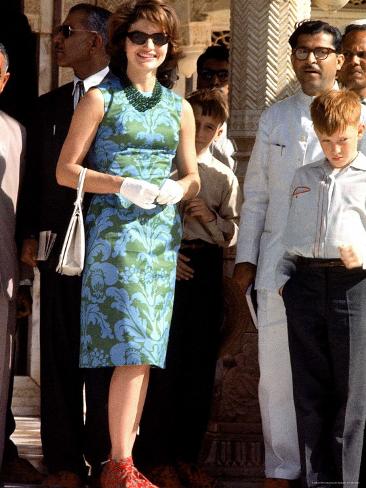
Jackie Kennedy was the American First Lady from 1961 – 1963 and during that time she entertained everyone with her classy dresses. She was always the best dressed one in the room and inspired a generation with her style.
In both these pictures we can see hints of the style that was popular in the 40s proving that designers always base their new designs on current styles and fads and them change a particular detail to make it their own.


Sunday, 18 November 2012

From Archaic to Hellenistic


Today I decided to look at the transformation that took place between the Archaic and Hellenistic periods by comparing two sculptures, one from each time period.

Cleobis (Kleobis) and Biton by Polymedes of Argon circa 580BC


These two statues are often referred to as one. They are usually either called “The Greek Twins” or “Cleobis (Kleobis) and Biton”.

“In the legend, Kleobis and Biton were Argives, the sons of Cydippe, a priestess of Hera. Cydippe was travelling from Argos to a festival in honor of Argive Hera. The oxen which were to pull her cart were overdue and her sons, Kleobis and Biton, pulled the cart the entire way (45 stadia, or 8.3 km/5.1 miles). Cydippe was impressed with their devotion to her and her goddess and she prayed to Hera, asking her to give her children the best gift a god could give to a mortal. Hera ordained that the brothers would die in their sleep, and after the feast the youths lay down in the temple of Hera, slept and never woke. Herodotus, who relates the story, says that the citizens of Argos donated a pair of statues to the sanctuary of Apollo at Delphi.” - http://en.wikipedia.org/wiki/Kleobis_and_Biton

The Archaic period in Greece came right after the Greek Dark Ages where everything was lost – even the language, so the one could say that the archaic period was somewhat like the Renaissance period later on in history. Like so many Greek statues, the kouroi are naked except for boots which may identify them as travelers. The proportions of the bodies are very well laid out, however the details are very minimal. The face is very triangular, and the hair doesn’t look real at all as the curls are modeled one by one and they are quite large so much so that there are only three on each side of the head. The sides transition into the front so abruptly that there is almost an edge. The ears are somewhat too large for the head as is the head compared to the neck. The torso might be considered too short in proportion to the total length. It is particularly interesting to note the shape of the knees. They are triangular and almost indented into the full leg.
Now let’s take a look at how the style of representing the human body transformed in the space of 550 years:
 
Laocoon and His Sons by Agesander, Athenodorus & Polydorus of Rhodes. 25BC
“The most detailed description of Laocoön's grisly fate was provided by Quintus Smyrnaeus in Posthomerica, a later, literary version of events following the Iliad. According to Quintus, Laocoön begged the Trojans to set fire to the horse to ensure it was not a trick. Athena, angry with him and the Trojans, shook the ground around Laocoön's feet and painfully blinded him. The Trojans, watching this unfold, assumed Laocoön was punished for the Trojans' mutilating and doubting Sinon, the undercover Greek soldier sent to convince the Trojans to let him and the horse inside their city walls. Thus, the Trojans wheeled the great wooden Horse in. Laocoön did not give up trying to convince the Trojans to burn the horse, and Athena makes him pay even further. She sends two giant sea serpents to strangle and kill him and his two sons. In another version of the story, it was said that Poseidon sent the sea serpents to strangle and kill Laocoön and his two sons.” - http://en.wikipedia.org/wiki/Laoco%C3%B6n 
The Hellenistic period, as I said before, came roughly 550 years after the Archaic period, it was the age when the sculptors were looking back at the work of the sculptors that came before them and were looking to create the same affect in a better way and developing new techniques. Again the figures are naked, which was the style in the Hellenistic period – but in a way, it was also an almost realistic depiction. In Ancient Greece it was very usual for men to walk around without clothes proudly. Here the proportions are, as much as they can be, perfect, and it is very detailed. In my opinion, it’s so detailed that it’s as if the sculptor(s) carved the whole anatomy and then added a layer of skin to cover it. The faces are much longer in shape, like a real face would be. The hair looks much more realistic as the general shape is carved as one whole thing and the details are added later. As opposed to the kouroi, the sides of the faces transition very smoothly into the front, sharp where they should be and soft where they should be. The ears are placed just right and are to the right proportion. The torso is the right length for the overall length of the body. The biggest difference between this and the first sculpture however is in the knees. Whereas before the knees pulled the focus because they were sculpted so ‘badly’ here they blend in because they are done just right, as if they were real, after all no one really notices anyone’s knees unless they are ‘ugly’.

Saturday, 17 November 2012

Olympic Logos Through the Ages


Today, I was surfing the internet and I came across some of the Olympic logos in the past, so for this next blog I’ve decided to take a look at the Olympic logos used in the last 88 years and how they have transformed according to the host city and any other aspects that might have influenced a particular design.

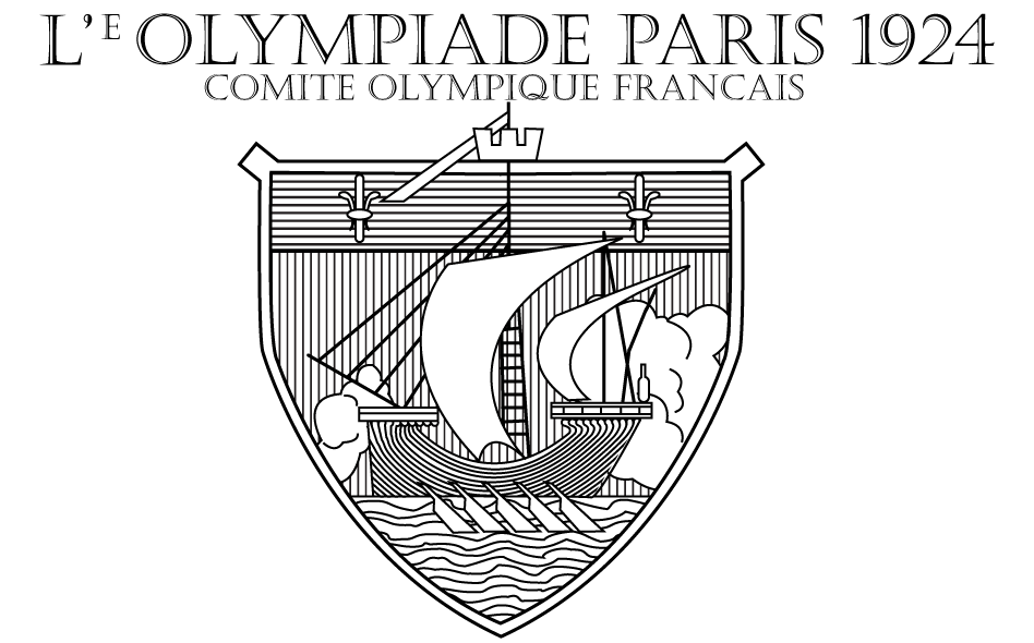
1924 – Paris, France

The logo for the 1924 Olympics in Paris was basically the first logo. The ‘logos’ for the previous games were actually posters depicting a scene rather than one general logo under which everything is presented. This logo, is perhaps the plainest Olympic logo I have ever seen. The Olympic colours are not included, the ship has virtually nothing to do with either the Olympics or Paris (except perhaps the water sports).

1928 – Amsterdam, Netherlands

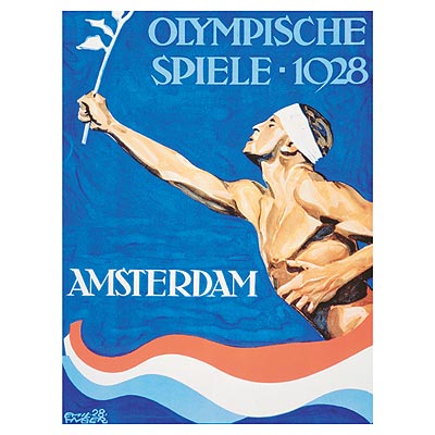
The Netherlands decided to go back to the poster concept, obviously deciding that the logo hadn’t worked for the French 4 years earlier. This poster depicts an athlete crossing a finish line drawn to look like the Dutch flag and instead of a baton the athlete is holding a tulip which is the national flower of Holland.

1932 – Los Angeles, USA

The Americans being... well, Americans and always wanting to do things in their own way as much as possible, decided to go back to the logo concept, and I have to say, they got it really right. The five Olympic rings are set in front of an American flag in the shape of a coat of arms. Going through the rings is an olive branch with a dove holding it in its beak – this is used to represent the hope for peace between nations during the games (and after). Here, we see the introduction of a motto – Citius, Altius, Forius – it is represented as a banner going around the rings so that one of each word is presented on either side of the Olympic ring logo as well as under it – the motto is Latin for ‘Faster, Higher, Stronger’

1936 – Berlin, Germany

The Germans went with just an outline logo in 1936, it included a bell with a German Eagle holding up the Olympic rings. On the rim of the bell stands the motto “Ich rufe die Jugend der Welt” which translates to ‘I call the youth of the world.’
(Although this was the official logo of the games in 1936 it was also the design of an actual bell which was made to be used during the games – the bell itself is a replica of the one we see in the logo above however it has a relief of the Brandenburg gate on the opposite side).

1940 – Tokyo, Japan

The 1940 Olympic Games were cancelled due to World War II; however the logo had already been released. Again it was released in poster format. The poster was simple enough, a white background with faded blue stripes at the top and bottom. Large plain black sans serif font as was the style in the 1940s in the middle the Olympic rings with a washed out ink, print (Japanese style) of a volcano atop the rings.

1944 and 1948 – London, United Kingdom

 
The 1944 games were again cancelled due to WWII, they were scheduled to take part in London however due to the ongoing war they were cancelled.
The 1948 games were not cancelled and they were held in London. Being the first games after the War everyone was anxious. They were dubbed the Austerity games because of the economic climate after the war. Germany and Japan were not invited to join in the games and while the USSR (Russia) was invited, they decided it would be better not to send any athletes. These were also the first games not to be hosted in a newly built Olympic Village and the first to be broadcast on TV.

 
The logo for these games was very simple, a black Big Ben and Houses of Parliament on a white background with the Olympic rings (black outline, white inside) in the foreground and plain serif font. A motto for these games was not included in the logo, which personally I think was a huge mistake on the organizers’ parts given that these were the first games after the war – a motto would have helped raise the moral of fans all over the world.
some information gathered from: http://en.wikipedia.org/wiki/1948_Summer_Olympics  

1952 - Helsinki, Finland

 
In 1952, it was Finland’s turn to host the Olympics. The colour scheme of the logo is simple and straight to the point – blue and white – the Finnish flag colours. The large white building which is ‘holding up’ the Olympic rings logo, is (or was) the city symbol of Helsinki, representing the city sponsoring or ‘holding up’ the games.

1956 - Melbourne, Austarlia

 
in the 1956 logo, one can see a pattern forming where the designers form the logo from one main colour, minimal details and they are reintroducing the idea of imagery related to the host country – also the Olympic rings are left uncoloured rather than with the colours of the Olympic flag. In the logo, an Olympic torch coming up from the map of Australia is again ‘holding up’ the Olympic rings. Around the border the words “16th Olympiad” and “Melbourne 1956” fill the top and bottom of the logo with green laurel leaves to represent the wreaths given to the champions of the games in Ancient Greece.
 

1960 - Rome, Italy

 
The 1960 games logo was the first and only logo to include an animal in the design; however given the animal I can understand why the designer decided to include it.
The animal at the top of the logo is a she-wolf feeding the two young boys known as Romulus and Remus. According to an old legend these two boys were abandoned by their father in the wild and when the new mother wolf found them she ‘raised’ them along with her own children, according to the legend, Romulus grew up to build the capital city, known today as Rome.
Underneath the wolf are the letters MCMLX which are the roman numerals for 1960. Underneath the numeral are the Olympic rings. This design has reverted back to black and white which to some seems very old fashioned given the context of the world (the era of flower power) however when one considers that the design is hinting at old Roman legends the colour palette is quite fitting.
1964 - Tokyo, Japan
 
 
1964 and Tokyo finally get their chance to host the games 20 years after they were set to host them and had to cancel. The design for this logo is quite simple and straightforward; a white background with a red circle (The Japanese flag) with the Olympic rings, beneath the circle, in a light brown with the text ‘TOKYO 1964’ in the same colour.

 1968 – Mexico City, Mexico


the logo for the 1968 games was one of the first to include the Olympic rings in full colour. From this year on, one starts to see a change in font styles, with each designer opting for a new, more modern font than the previous ones. Here, the designer decided to form the word ‘Mexico’ and the number ‘68’ with 3 grey split lines with at least one of the lines from each letter flowing on to the next one and so on. Personally I think that the grey text was a good choice to keep the Olympic rings as the only source of colour and therefore a stronger focal point, however I disagree with the placement of the rings on the number 68 as the number is not that recognizable.

1972 - Munich, (West) Germany

 
This logo is reminiscent of the 1964 logo with the simple design of the Olympic rings and a circle (this design is more simplified than the other with the complete exclusion of text). The colour palette of this logo is a softer blue on a white background. In contrast to the 1964 logo, the circle is ‘striped’ to give the impression of movement.
 

1976 - Montreal, Canada

 
1976 and yet another design with red as the main colour of the logo. The most interesting part of this design is the inclusion of the letter ‘M’ for Montreal above the Olympic rings in such a way that it makes everything appear woven together. It is also interesting to note that the overall shape of the rings and the ‘M’ together, form an abstract form of a maple leaf which is represented on the Canadian flag.

1982 - Moscow, Russia (Formerly USSR)

 
Again , red is the predominant colour in this logo, although not coincidently, considering that red is the colour associated with communism. Above the usual 5 rings, are 6 lines (forming in to 5) leading up to a point with a star at the top. This is used to represent the coming of Nations together in one ‘star’ city – Moscow.

1984 - Los Angeles, USA

 
The 1984 logo is very much similar to the previous two; however the colour in this one is more heavily played on, incorporating the three main colours in the flag of the United States: red, white and blue. A similar concept to the other two is the lines included in the logo. Two of the three stars at the top of the logo are formed using elongated lines to create an effect of motion – almost as if one were watching an athlete run. The decision to include the stars is quite obvious, not only are there stars representing the States on the flag, the stars are also representing the athletes – ‘the stars’ of the competition. The font is simple, bold and black but in Italic to continue the effect of motion. At the very bottom the Olympic rings in full colour.

1988 - Seoul, South Korea

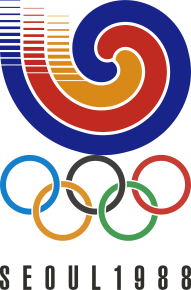
Here, the Koreans kept much of the concepts introduced in the previous logo: the tri-coloured shape, the lines to help create movement, the simple text and the full colour Olympic rings. The new concept here is the decision to add yellow in the three main colours, replacing the white in the previous logo. The swirls in the logo can also hint to the South Korean flag where the red and blue join together in a swirl.

1992 - Barcelona, Spain

From this logo on, we start to see shapes representing one aspect or another of the host country formed into a person, or rather, athlete. Here, one can see three brush strokes, each in a different colour, forming a gymnast in a mid-air jump with their legs outstretched. The colours of the brush strokes represent the Spanish flag: red and yellow stripes with just a touch of blue (which can be found on the Royal Coat of Arms on the flag). Again the use of a simple font helps draw the eyes toward the main component of the logo. The Olympic rings are again represented in full colour.

1996 - Atlanta, USA

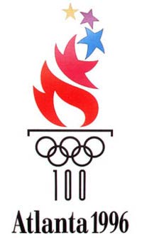
The logo for the 1996 games is based on the 100thanniversary of the first games after the founding of the International Olympics Committee (IOC). The logo is an Olympic torch with a red stencil flame coming out of it, and the flames transition smoothly into the American stars (although the inclusion of a purple star I strongly disagree with). At the base of the torch are the Olympic rings in black with the number 100 under the rings. Another simple font again, helps the viewer’s attention to be drawn to the torch logo rather than the text.

2000 - Sydney, Australia


The logo for the 2000 games is a very visually exciting one. The figure of a rhythmic gymnast during a routine are formed by a large red boomerang and two smaller yellow ones representing the legs and arms, a smaller circle for the head which represents the hot Australian sun and the blue ribbon forms the outline of the Sydney Opera house – which is the first which pops to mind when one thinks of Sydney. The font here isn’t as simple as the previous few, rather it seems as if it is formed using paint brushes in broad rough strokes. The rings are once again represented at the bottom in full colour.

2004 - Athens, Greece

Obviously, the motto for these games was ‘Welcome Home’, referring to the history of the games connected with that of the host country’s. Similarly the logo hints at symbols connected with the games and the host country. The background is a textured blue to represent the Greek flag, with a white laurel reef to represent the reef that was presented to the champions of the games in Ancient Greece. The two colours also represent those on the Greek flag. The font is, again, a simple one, however this time the colour is blue, obviously to tie in with the background of the logo, underneath it all, the five full colour Olympic rings.

2008 - Beijing, China

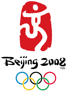
The logo for the Beijing Olympics was another apt design for the host country. The background is red to represent the colour of the Chinese flag, in white is a dancing figure based on the Chinese symbol for the word ‘capital’ obviously referring to Beijing. Here, the designer (much like the one who designed the 2000 logo) strays away from traditional and simple fonts, opting instead for a font closely representing the traditional Chinese alphabet and symbols.

2012 - London, United Kingdom

And now we come to the latest logo – London 2012. As one can easily notice upon first seeing the logo, it is almost completely independent from previous logos.
Here the designer has opted to work with extraordinary colours – mostly to represent the extraordinary year that the host city has had (with the Diamond Jubilee taking place only a month before the Olympic Opening), also being the only city to host the games for three editions ,the designers wanted to express this ‘uniqueness’ in the logo itself. The logo itself consists of two colours other than white. There have been various editions of this logo, each with their own colour combination, however the two most common combinations were a dark pink with a bright yellow border (appealing to a younger audience which ties in with the motto: “Inspire a generation”) and a dark blue with a red border (showing the colours of the Union Jack) in both versions, the word ‘London’ and the Olympic rings are white.
The font of the numbers to form the year, is inspired by the strange fonts and shapes introduced to the world through the internet. No doubt it’s a more modern take on a logo. Personally I agree with the designer’s idea to keep away from the colours traditionally used in Olympic logos and to use much more striking, contrasting colours.
Who knows what logo will be revealed in four years’ time, when Rio hosts the games for the first time. Although a logo has already been released (a number of them in fact) it is traditional for the host city to ‘tweak’ the logo in the space of those four years between its predecessor’s games and its own.